ABCDEFGHIJKLMNOPQRSTUVWXYZ
abcdefghijklmnopqrstuvwxyz
0123456789 & ! ? @ ₹ $ %
Sphinx of black quartz, judge my vow.
- Regular400
- Bold700
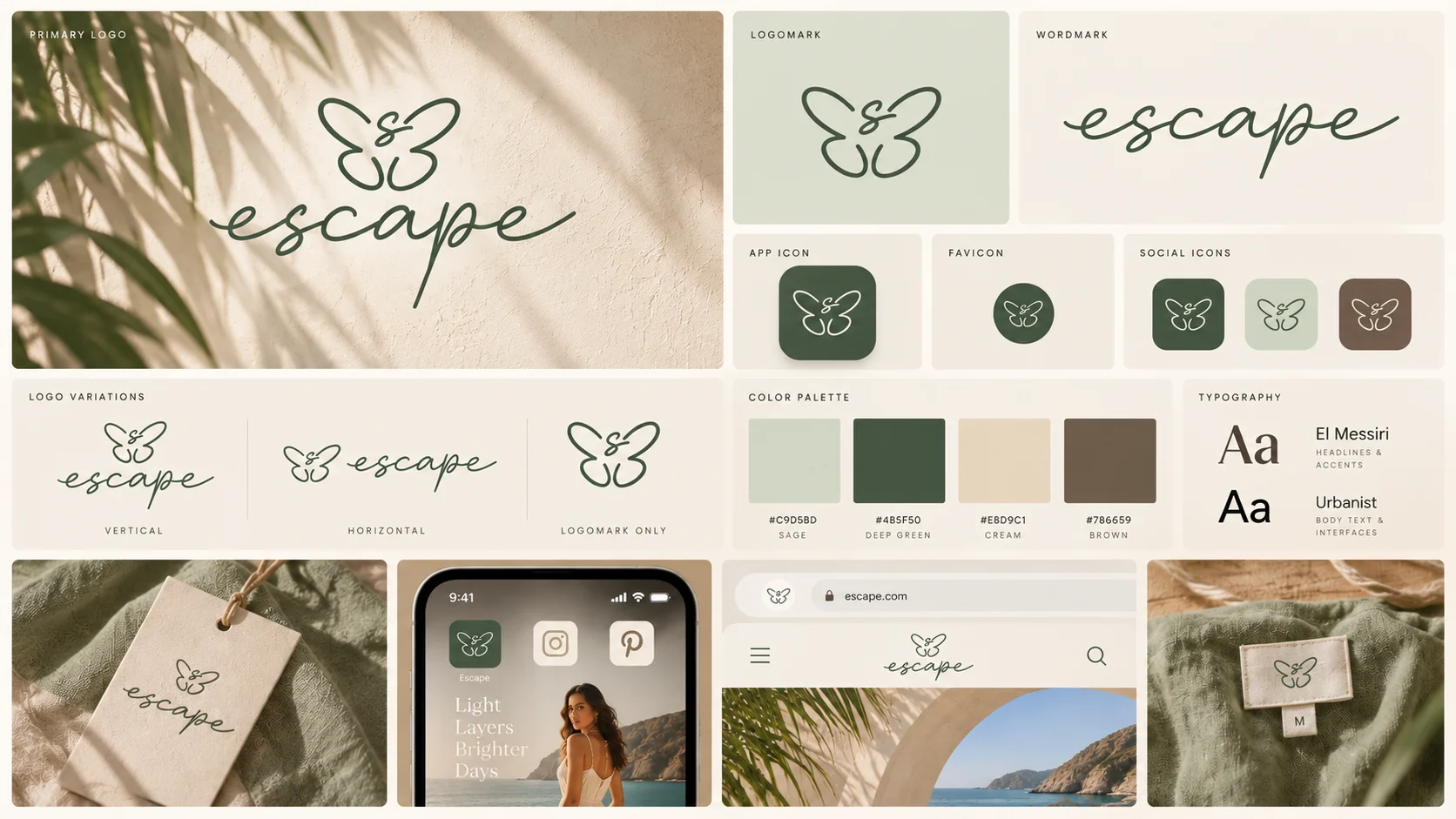
Escape makes relaxed clothes for summer and casual days. They needed a brand that felt the same way. We built it from scratch: a butterfly mark, a soft palette, two typefaces, and packaging and tags that carry the mood home.
A clothing brand lives or dies on feel. Escape had the clothes, easy summer and casual wear, but no identity to say what wearing them feels like. Every touchpoint, from the logo to the swing tag to the box it arrives in, needed building.
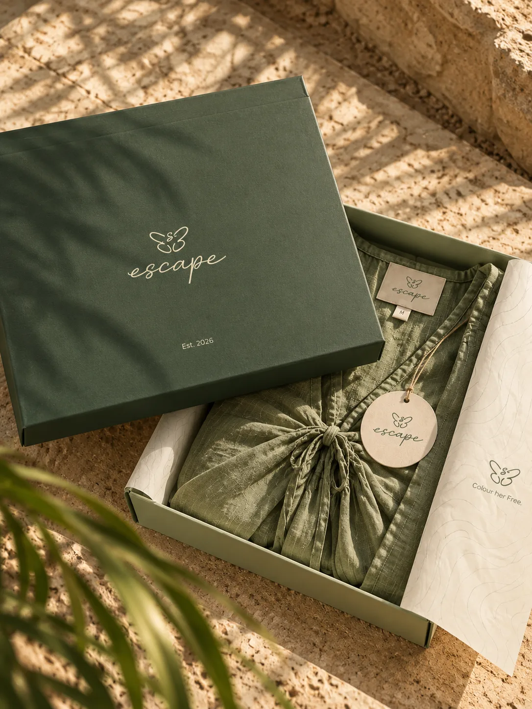
We started with the mood: slow summer days, linen, sand. That set a palette of sage, forest green, sand and taupe, and a type pairing of El Messiri for headlines and Urbanist for everything else. Then we carried it through every piece a clothing brand needs: logo, neck labels, swing tags, gift boxes and transparent packaging.
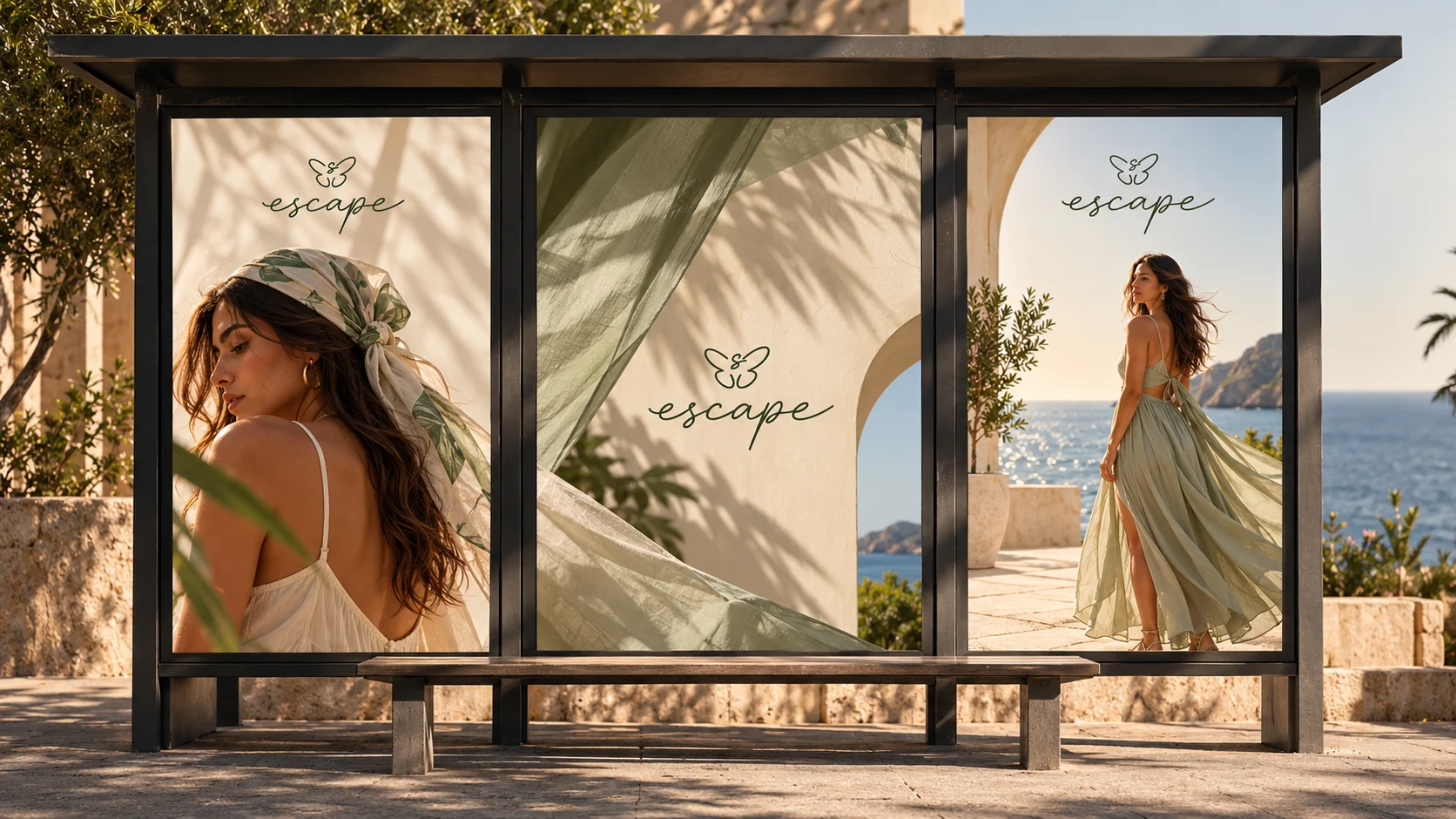
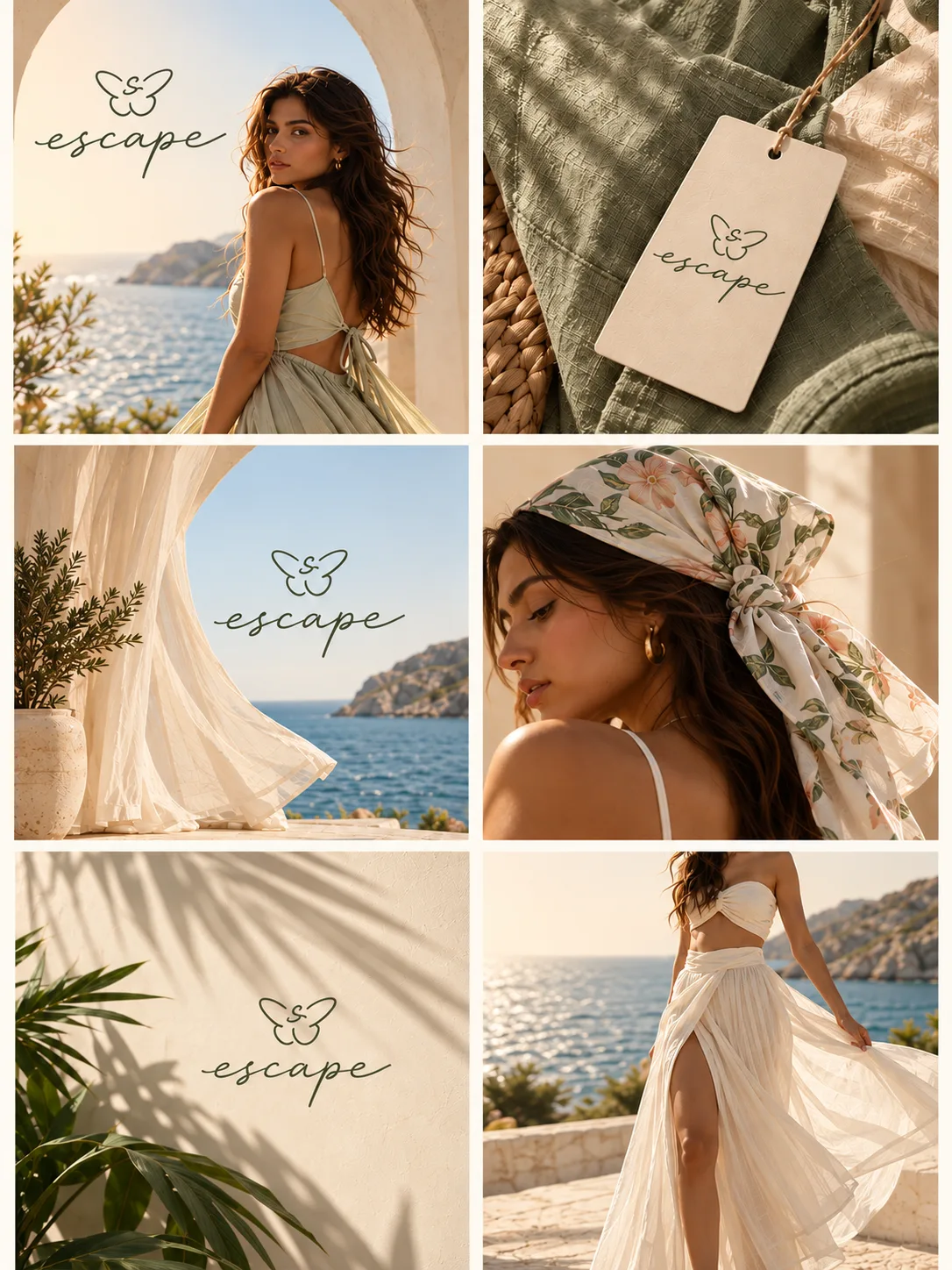
Escape now looks like one brand wherever you meet it. The butterfly sits on the neck label, the tag, the box lid and the sticker, and the same four colours hold it all together, from the rail to the unboxing.
The mark is a butterfly drawn in one loose script line, light enough to stitch onto a neck label and still hold its own printed in gold on a box lid. El Messiri brings a little flourish to headlines while Urbanist keeps the small print clean. The palette borrows from linen and sand, so the brand never shouts over the clothes.
The butterfly mark, one unbroken script line that feels as relaxed as the clothes it sits on.
ABCDEFGHIJKLMNOPQRSTUVWXYZ
abcdefghijklmnopqrstuvwxyz
0123456789 & ! ? @ ₹ $ %
Sphinx of black quartz, judge my vow.
ABCDEFGHIJKLMNOPQRSTUVWXYZ
abcdefghijklmnopqrstuvwxyz
0123456789 & ! ? @ ₹ $ %
Sphinx of black quartz, judge my vow.
Type, colour, boxes, tags and labels, all speaking the same soft summer language, right down to the barcode.